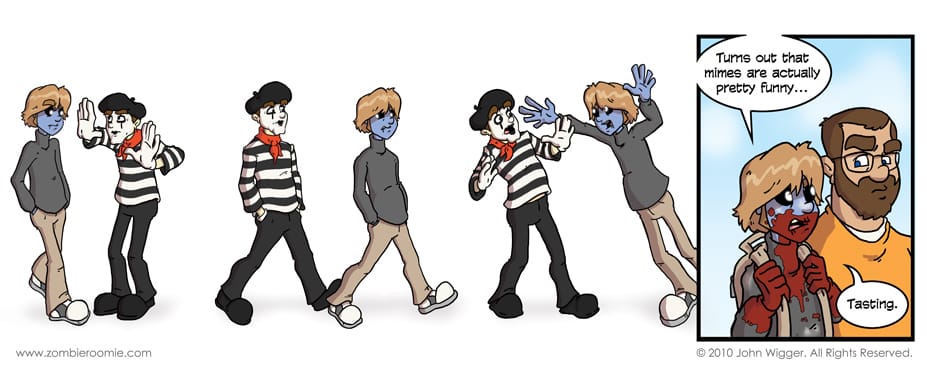
Oh, George... We saw that one coming a mile away. I like the border-less portion and the change to the fourth panel having a border to denote a different time period. Having multiple "panels" without borders and relying on the whitespace to indicate space is a neat effect and I think it worked well here... Especially with a mime when it's going to be pantomime anyway. This wasn't going to be the comic I had for today. In fact I came up with this idea very, very last minute. The joke is pretty obvious, but a zombie eating a mime... where can you go wrong? -- In other news... I've started the Zombie Roomie facebook page. If you like Zombie Roomie and you're into facebook... it's the place to be~! I'm going to be posting the sketches for each comic over there along with many other cool things. Join the siege! Go click the like button...


