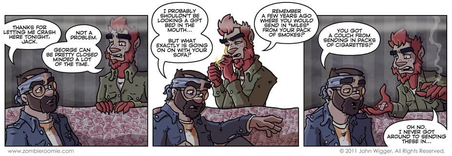
Careful readers will notice I've been doing the remove the border/background to pop a panel out to vary the visual rhythm of the strips a bunch lately. I know I've been doing it probably too much, but I really think it looks pretty cool... especially when I don't change up the camera angles between panels. I don't know when I'll stop doing it so frequently, but I'm having fun with it now. If you hate it, sorry. But, I'm not going to stop on your account. When it came time to do the "miles" sofa/mound I didn't want to just toss some pattern down or have a checkerboard looking thing... it needed to be much more jumbled. I ended up creating a brush in Photoshop of the side of a pack of smokes I found on Google image search and just scattered the crap out of it. Another thing I liked doing in this strip was the reflected light from Jack lighting his cigarette. Lighting effects like that are something I've really gotten much better at since I started Zombie Roomie. They're always something that will add something special to any strip.
