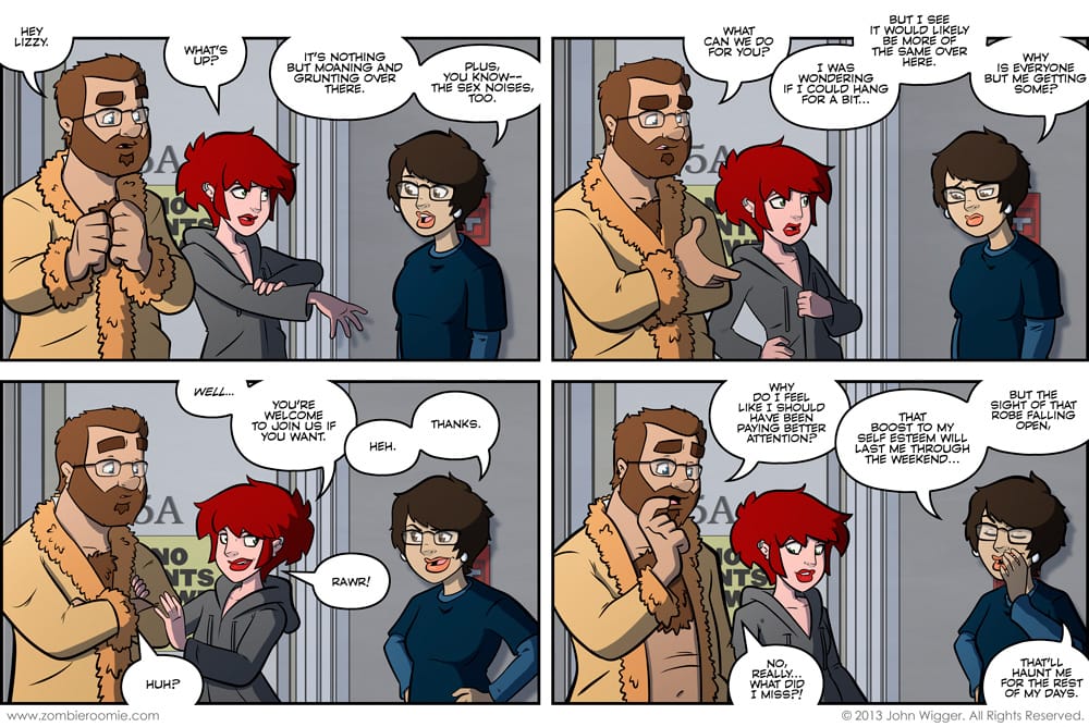
It's another jumbo-sized comic! I was planning this strip and three characters in four panels with the amount of dialogue I had outlined just wouldn't work in a normal sized strip... so I broke out the wide screen template. I like how it allows me to keep the character art larger and I didn't have to smush them into half as much space per panel. In fact I was able to get my favorite Lizzy art to date out of it. This is the start of a Lizzy-centric arc and I'm happy to finally have something that focuses on her. Like I've said before, she's always just been the roommate or the girl who wears the logo tees. I've been having fun with her character design by getting her hair just right and having her gain some weight. I really like the heavier Lizzy. I think it finally lets her be... well... Lizzy.


